A large part of our work was the DigiPack and poster that come with the release of a new album.
We have made a preliminary DigiPack (found in an earlier post) but we have now finished our final piece.
Our spec said that we needed at least 4 sides and 6 images (to be taken ourselves|)
This is the final piece.
The top image features the front and back cover for our DigiPack, It consists of our main image, the rose against the smashed mirror and the image of two of the band members against a doorway. We selected these images as we felt that the rose was striking and gathered focus therefore helping it to stand out. We used the back image as we felt that it was important to feature the band members and the image does that in a way that reflects the general mood of the album, withdrawn and shaded.

The inside features a space for the disc and room for a selection of limited edition cards, the images inside are two of the band members in one long image, we chose this as we felt that it was important to stick to a format that we had used for the exterior.
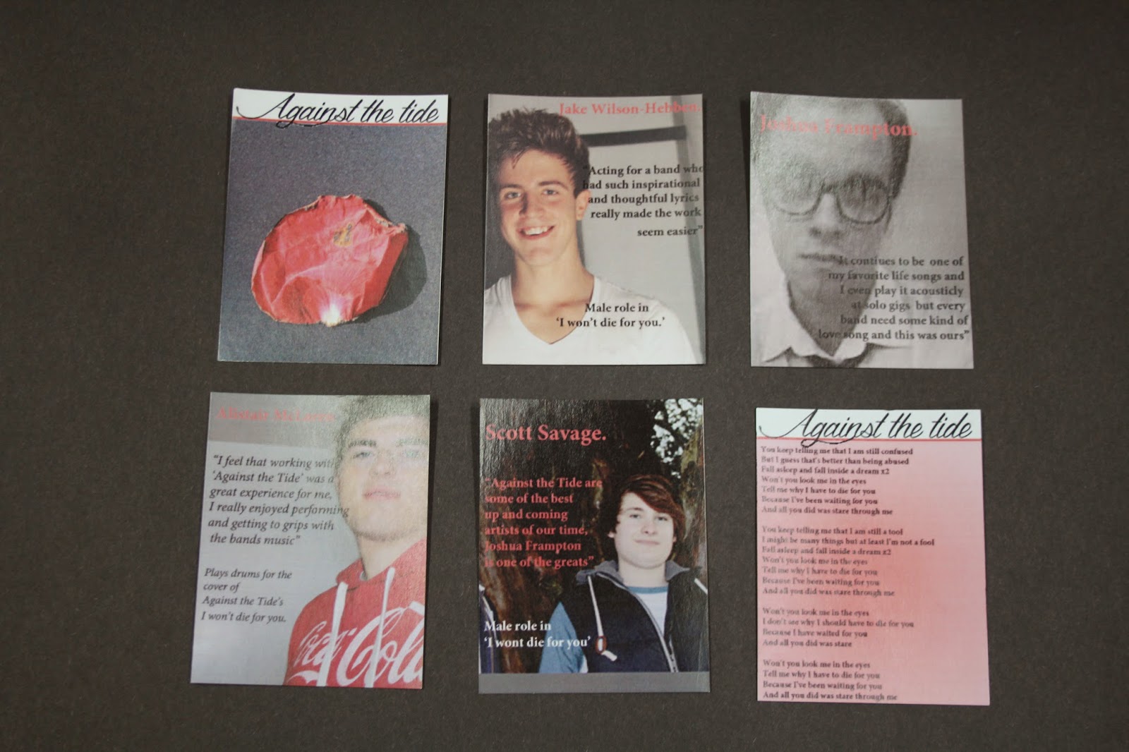
Finally, we included a limited edition selection of cards detailing individual band members and their opinions of the songs and band. We felt that this was important as our target audience would be people who are already fans of the band and are therefore going to be interested in the individual band members more so than other people would be.
The images from the cards are of the band members, this excludes the first and last card. On the first card we chose an image of a dying rose petal as we felt that this continued the image we chose for our front cover. the last card is a gradient effect as we chose to put the lyrics of the title song (I won't die for you) here.
 This is a copy of our poster, we used a similar image to the ones that we used for our album, this was important to us as we wanted it to be a clear link. With that in mind we kept the Title image the same, in addition we were sure to use the same record label and take quotes from magazines with the correct genre of music to insure that everything was compatible.


No comments:
Post a Comment